Introducing Goals

It always seems impossible until it’s done.
— Nelson Mandela

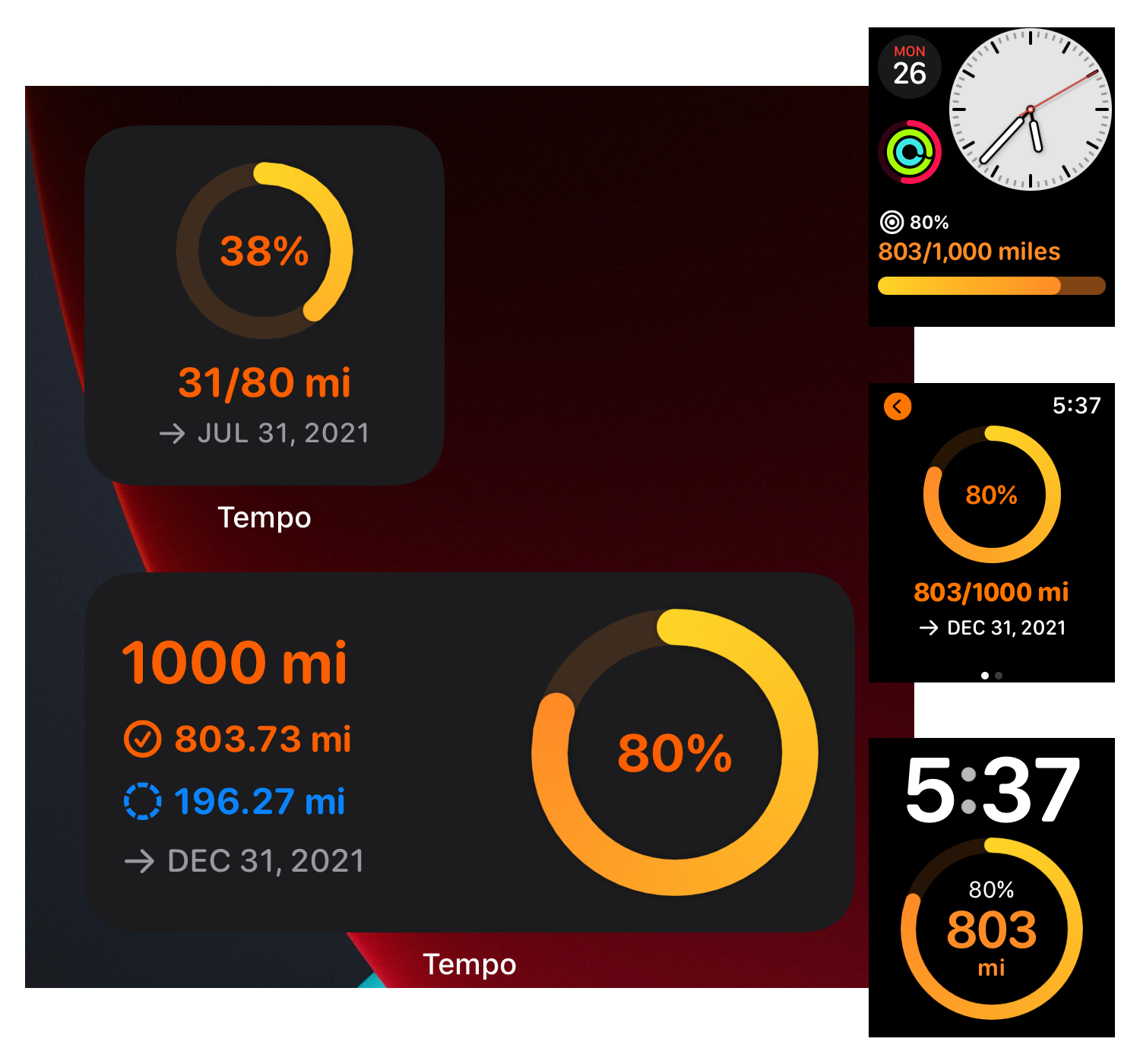
Last year, when I was working on Tempo 3, I had a bunch of features on the roadmap that I wanted to build and launch with Tempo 3. As I scoped out work for each of those features, a lot of them turned out to be big enough to be an app in itself. I won’t list all of the yet-to-be-released features, but two of those features were Personal Bests and Goals. Personal Bests was released earlier this year, and today Tempo v3.4.0 is launching with Goals! 🎉

TempoGoalsForBlog.png

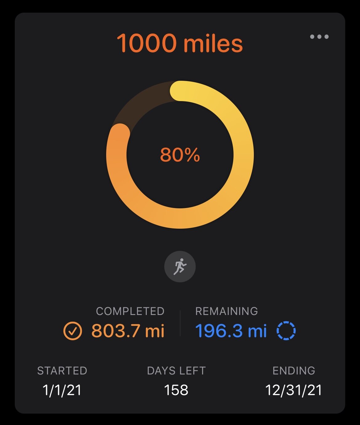
Goals in Tempo is built around the idea of completing a total distance by doing one or more workouts. Goals can be great in keeping motivation high to maintain a consistent training routine, chase a new fitness peak, or do both!

Tempo’s goal setup is simple and fast, and tracking is fully automated. A goal can be setup to run, walk, or hike a total distance once over a set number of days, or repeat weekly or monthly.

Our workouts are only a fraction of the time throughout the day/week, but having a goal as a constant reminder really helps with the motivation to show up for the next workout and maintain that forward momentum. So Goals in Tempo are built to be everywhere,

  • On your Home Screen with beautiful goals widgets

  • On your favorite Apple Watch face with a goal complication

  • And in Tempo app on your iPhone and Apple Watch

That’s Goals in a nutshell. I hope you enjoy it and it helps you achieve your future training and fitness goals! 🎯🙌👏

* * *

Thank you!

I want to take a moment and say thanks. As I said above, every key feature in Tempo could be a standalone app in itself. All the work—iOS app, watchOS app, widgets, complications, synching, and more—requires a lot of time and effort. Tempo’s promise of privacy and attention to detail to bring it all together is what makes it so great for all of us. It’s insightful, motivating, and reliable. We are also in the early days of making it sustainable and long-lasting, and your support helps immensely. Thank you for being part of building our favorite training app!

Introducing Personal Bests

There is No Finish Line.
— Nike

In fitness, and in life, we aspire to be our best. The competition is not with anyone else, but a life-long pursuit of improving and pushing our own personal limits. This gets even more focussed for all of us everyday athletes, who log workouts day in, day out, at odd hours, for weeks, months, and years. It’s mostly driven by the joy of running, but over time, we also start appreciating the game of self-discipline to chase the next level of self-improvement. Seeing those times drop, on a race day, or just on a casual training day, is more gratifying than any race medals. Unlocking a new Personal Best is a badge of self-fulfillment, accomplished with relentless commitment to self-discipline. It’s the glorious part of all the hard work that deserves a celebration alongside the daily log of healthy living.

Personal Bests has been one of the oldest on the list of most requested features for Tempo. While it seems fairly straightforward at a surface level, implementing it locally on the device (vs taking all of our fitness data to a server) made this feature complex enough that I have had a few planning/design iterations for a couple of years now. So I am really excited to be finally releasing it.

The FAQ covers all the details of Personal Bests for easier reference. Here is a quick summary.

Tempo identifies and showcases PB times from 100 meters to 26.2 miles. Each Personal Best is calculated in 2 steps,

  1. An initial scan identifies PB by comparing average pace of every workout.

  2. Tempo then goes further by analyzing every data sample from every workout to aggregate the fastest times from 100m to 26.2. This is the key step to identify the most accurate (and real) fastest times. Imagine running a fast mile within a 5K workout that you walked for the second half. The average pace of that workout might not reveal that you ran your life’s best 1mi performance ever. By aggregating individual data samples within every workout Tempo can detect these interim fastest time segments.

In addition, Step 2 above also enables Tempo to highlight fastest times for every workout—a new section in the Workout Details. This section further allows interacting with the fastest time segments on a map and graphs, highlighted just for the selected fast time.

One of the challenges with analyzing data samples is the accuracy of each data sample. These data samples are short distances (few meters in length) with start and end timestamps, and are recorded by sensors (like GPS) of the workout tracking device (Apple Watch). Sometimes this data can be inaccurate (GPS glitches, etc), and result in impossibly fast time segments. Tempo addresses this by providing options to filter paces that are unattainably faster based on following 2 options,

  1. World Records option filters everything faster than current world record for the given distance.

  2. Tempo Pace Thresholds is a custom (and a very generous) fastest time estimator for various distances. This is based on your training data (and fitness level) and updates with your fitness level.

And if the above filtering options still misses any inaccurate data, Tempo also has the ability to mark individual Personal Best Records, or an entire workout, to be ignored from the Personal Bests list.

A lot of us have been running for decades, and possibly have some of our PB times that happened before we started using Apple Health to track all the fitness data. If that’s you, you can manually log a workout with that time for Tempo to showcase, and track it.

Enjoy, and Happy Chasing that Next PB! 🏅

Introducing Heart Rate Zones

One of the key ingredients of training well is heart rate, and more specifically heart rate zones. Heart rate zones can be really useful in targeting and understanding the effort type of every workout.

There is a lot of great information about heart rate based training on the web, so we won't get too much into that here. But here's a quick primer: running pace from warmup to sprinting hard usually aligns across different heart rate zones. Heart rate is the primary factor that drives performance, and each heart rate zone is a range with lower and upper threshold based on the percentage of the maximum heart rate. Maximum heart rate itself varies based on factors like age, genetics, fitness, and more. Heart rate zones are termed differently depending on the context/type of training. Generally speaking, there are 5 zones like warmup, maintain fitness, aerobic, anaerobic, and extreme. Each zone requires incrementally harder effort to maintain, and we can sustain working out for much longer at lower zones (lower heart rate range) vs higher zones.

When I started building this feature in Tempo, I knew it would require the ability to change the maximum heart rate, but I quickly realized that it needed to go further into personalization. Tempo's heart rate zones implementation is super configurable to match any athlete's general fitness profile as well as training goals. It enables following options,

  • Edit upper and lower limit for each heart rate zone
  • Edit name of each heart rate zone
  • Multiple naming schemes for heart rate zones
  • And of course, the ability to edit maximum heart rate

I am really glad how this turned out. I believe Tempo is the first iOS app for runners to provide such an extensive level of customization for heart rate based training.

Tempo 3: The Beginning of a New Tempo

It does not matter how slowly you go as long as you do not stop.
— Confucius
T3LaunchHero.png

This year has been anything but normal, and when I started the work on Tempo 3 earlier this year, I had no idea how far I would get, or when I would be able to ship it.

Tempo 3 is based on following:

  • Feedback and feature requests from many runners already using Tempo

  • My own wishlist as a runner

  • Apple technology updates—code level, UI/UX level, and generally in iOS

I feel a little embarrassed to admit how many different lists I have made to structure this work. There’s just so much to do, but what I can tell you is that this is just the beginning of what you are seeing.

A few weeks ago, when I looked at the roadmap of macro items for Tempo 3, I felt a little defeated because it seemed I had hardly scratched the surface. But that despair feeling slowly faded into joy after I had to spend time with v2.12.1 again for a bit. I have been using Tempo 3 for so long and so much now, that I had stopped noticing how far we have come. The excitement has grown more over the last week as everything came together for the release, and so many beta testers sent their comments on how amazing the app was looking. I must call out here that I feel really fortunate to have a great group of runners as beta testers for Tempo. Their feedback and reporting bugs has made this release possible. 🙏

It’s 8:48 PM ET on October 14 right now. My plan is to do a phased release of Tempo tonight and test everything before releasing it for everyone tomorrow. And I just started writing this post. Add to that the hours of sleepless weekends and weekdays over last couple of weeks while working on brand new App Store screenshots, press kit, Tempo’s homepage, and a lot of other launch items, I feel a little exhausted. So I am going to make this post short by leaving you with some quick highlights about this release.

If you are really curious about the details of this release, you should checkout the following. It’s pretty much a brand new app, and every part describing the app has been redone and helpful to learn from.

  • App Store listing and screenshots

  • Release Notes

  • New FAQ for Tempo (still a work in progress, but hey, we finally have one!)

  • New homepage for Tempo

  • Press Kit

  • What’s New and App Intro screens in the app. You can launch them from the About section of the app settings

  • Oh yeah, and the entire app itself! :)

Here are the highlights:

  • The work-in-progress version for this effort was set to 2.14 over the summer, so Tempo 3 work was appropriately codenamed Project Valentine.

  • We have a brand new UI and the primary change is switching to the standard San Francisco font family. When I initially finished updating the entire app with SF, I felt super guilty for not doing it earlier, and worse that it had to wait longer. I am sorry.

  • I had been procrastinating on switching the font to SF for a while now, but with iOS 14 Widgets it was obvious. There’s no way I was shipping Tempo widgets with custom font for everyone’s Home Screen. And you can’t go from widgets in SF to app in Avenir Next.

  • The primary driver for the new workout details screen was scalability in the structure and layout. There’s a lot more data that’s in the works that will end up here, but it’s already looking so 😍.

  • The new custom date range option for the now new Trends started last winter and has been living on a branch all this time.

  • Adding a workout manually is something that has been finished and ready since last January, but I didn’t ship it because if you added a workout say 5 years before your first workout in the Health app (I did that to add a PR marathon from 2009), it would instantly make the Trends useless. So this feature had to wait until we had custom trends date selection options.

  • I had at least 3 different folks reach out to me asking about how Intensity Calendar’s circles worked. One of them is a founding Tempo customers. He was frustrated, because the calculations didn’t make sense for his data. We did a few e-mail exchanges, and with that feedback it was obvious to me that I needed to do better with this functionality. The updates to Intensity Calendar is a result of the collaboration with him. Very grateful for his patience and help on this.

  • I was bummed to not be able to release Tempo 3 on day one of iOS 14 arrival. Part of me was hoping that iOS 14 won’t come out until the new iPhone 12. (Not bad for that estimate, we are launching just a day before iPhone 12 pre-orders.) But it was a blessing in disguise—I took a step back, assessed what needed to be done, trimmed some scope, without shredding it, and really got to finish some quality work that I wanted done for this launch.

  • My plan was to get the app submitted for review last Friday on Oct 9, but that didn’t happen, and I was still at it on Sunday Oct 11th. This Sunday in October is usually the marathon Sunday for me. In a normal year, I would be running in the streets of Chicago. This year it ended up being “get Tempo to the App Store” marathon. I made it to the finish line in the evening. Thanks to the App Store review team, Tempo was also approved later that night!

My special thanks to Stephanie, who has been a great beta tester and also helped with getting the FAQ going.

I guess this post isn’t as short as I expected. Time to go do some launch testing. :)

WWDC20 General Impressions

First, my thanks to everyone at Apple for making this happen, even more so this year. It has been a great Dub Dub, and I am inspired and excited about the coming year.

TL;DR

Excellent week. I still miss being there with everyone in person, but that’s life right now. Hope we can converge the online and in-person format going forward.

Keynote

Keynote was so well done. The intro instantly made me feel connected with all my virtual participants. The content was well paced and formatted. The video quality was as always very much to Apple standards, but what stood out was how nicely it zoomed through different presenters. Going into this week, I dreaded that the keynote would feel like a lame online conference, where presenters would either just get on a video call, do their parts, or had somehow already done their parts to form a linked up disparate demo. None of that at all, it was a pleasant show, and almost felt interactive in a way. The blending of different sites of Apple Park, Craig running, Julz dancing, and so much more, made it delightful. In a way this keynote felt light and refreshing, the presenters felt smooth, and it went fast.

SOTU

Platforms State of the Union is a must watch if you are a developer and get to watch only 1 session from this week. While I am super interested and can’t wait to be on Apple Silicon, the details about it felt like it could have been a dedicated session in itself. It sort of felt inverted, because the keynote talked about the Apple Silicon at the end, and SOTU started with it, and I was more curious to hear about new software parts first.

Sessions

Sessions have been my favorite part this year. It’s Friday, and I do not feel exhausted from watching hour long sessions in dark. It’s been very easy to stay up-to-date. 

  • The short and to the point sessions help maintain the rhythm for me, even with other distractions while at home.

  • I love the ability to copy code while watching a session.

  • Quick links to forums from each session is convenient.

  • When I originally saw the schedule, I wondered why not just upload all the videos on Monday, but the daily pacing has helped maintain my sanity and not get overwhelmed.

  • The brevity of these sessions will make them great reference for future work too. I usually have to plan around rewatching a WWDC session for reference, or it takes a good 10-15 mins to parse through one to find what I am looking for. This year’s sessions are so compact and to the point that I will be able to just watch the whole thing instead of scrubbing through them. And copying code feature is going to be extremely useful here too.

Labs

Labs have been easy to schedule and really well done. I have been to 2 labs (and 1 scheduled for today), and like every year, each one has been a pleasant and insightful 1-on-1 discussion that quickly helped me figure out what I needed.

I almost missed one of the labs, because I didn’t realize that my request could still be confirmed after an initial decline. It would have been nice if there was a push notification sent to the Developer app about the status change of my lab request.

Daily Recaps

Serenity Caldwell’s daily recaps are blazing fast ongoing summary of Dub Dub. They are fun to watch! I am pointing everyone, who are not actively participating this week, to go watch these as a quick rundown of what’s happening at WWDC this week. I hope these are put together somewhere in a playlist for future reference.

Announcements

I will leave the detailed comprehension and analysis of all the new announcements for the experts. As a developer, my generalized take is that following will make my life so much easier,

  • Xcode Improvements. So much faster!

  • SwiftUI Updates

  • Apple Watch Complications using SwiftUI

  • StoreKit Testing framework

  • SF Symbols 2

Other things to highlight here from the announcements,

  • It’s pretty clear that SwiftUI is the future of UI development on Apple platforms.

  • Apple Silicon is here! With that + Catalyst from last year, it seems that we should all start planning and preparing for our iOS apps running on Mac in some shape or form.

  • Once again, Apple just showed everyone how privacy is an ongoing thing that Apple relentlessly focuses on, and made it so much easier for all of us to have better control over our privacy. These new controls seem very user-friendly, and they will enable everyone to be aware of what we might be sharing, or share in a limited manner. 👏

There is a lot more that will affect both my apps and daily life as a developer, but it’s only the Friday of WWDC week, and I am still processing it.

The Apple Way

I can’t imagine the crazy logistics that went into orchestrating all of this. This was the first year, and I hope the only year with current circumstances, but in no way it felt like a 1.0, with rough edges. You can tell a lot of thought and care went into every detail. The finesse through all of it is something that we take for granted from Apple, but in this case there were no years of behind-the-scenes refinements, time for a thousand no’s, ability to collaborate physically in one place, without any distractions, and Apple did what Apple does best—everything felt right and just worked.

I missed making new friends, seeing folks I admire, catching up with old friends, being together in person with everyone, but there are so many great parts to this, and part of me wants this format going forward. I hope Apple figures out a way to converge the online and physical formats into a new WWDC of the future.